
LB Styling
Role
Timeline
UX/UI Designer
80 hours
Description
This was my capstone 3 project for Designlab's UX Academy. Create a responsive website for mobile and desktop.
Project goals
1
Make a responsive website for LB styling
2
Find a way to make booking an appointment quicker for users
Content
01 -Overview
02 -The problem
03- Empathize & define
04 -Ideate
05 -Prototyping & testing
06 -Iterate
07 -Summary
Overview
Welcome to LB Styling
Lidia B (LB), is your go to Miami stylist specializing in hair color, hair extensions and makeup. Lidia has come to me with the goal of creating a responsive website for her current and new clients to book an appointment. She wants to be able to show her clients the available slots to book an appointment so that they don’t have to guess her availability. An online website will allow clients to see her availability, her estimated prices, and contact her both through desktop and mobile.


The Problem
What do our ladies really want?
Users have to text or message her through Instagram in order to book an appointment. Her busy schedule keeps her from being able to respond to clients in a timely manner. In turn this costs her some potential clients or keeps her from maintaining her current ones. How can we make the booking process easy for her clientele?
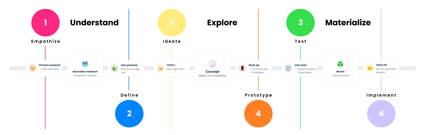
Here is the design process I'll use to tackle this problem


Empathize & Define
Discovering pain-points
I conducted secondary research in order to dig into what my users might look for when booking appointments. I wanted to get personal with my research and truly get a feel for what my users desire, so I began interviewing four different users on what they keep their eye out for. I wanted to see what they preferred when booking appointments and what has frustrated them with the process in previous experiences.
User interviews
I interviewed four different women to see their thought process at all stages when booking an appointment and if their backgrounds affected their decision making.
Meet my lovely participants!
MICHELLE
LOURDES
MYKAYA
VIBIEN
Competitive analysis
To complete my research, I decided to look at other competitors and different types of booking systems to see what processes might be the most familiar for users and what designs might aid users to complete their goals more efficiently.

Madison Reed

Paul Mitchell

Hair cuttery salon

Vagaro
PROS
-
User control and freedom
-
clear pricing and timing of services
-
clear success and error message
-
autofill
CONS
-
overwhelming amount of pop-up ads
-
information overload
PROS
-
User control and freedom
-
clear pricing and timing of services
-
clear success and error message
-
autofill
CONS
-
overwhelming amount of pop-up ads
-
information overload
PROS
-
inconsistent color palette
-
overuse of shadows
-
no direct booking process, only through third party
CONS
-
too many steps for form filling
-
excessive use of icons
-
placeholder text too large
PROS
-
Add several services at once
-
clear description of service and price
CONS
-
must create account to book
-
multiple navigation bars might confuse users
-
cannot access landing page without clicking on logo
User persona

Ideate
Designing responsively
Based on my research, I decided to break down what was needed in order to accomplish my users goals and LB styling goals. I created a sitemap, user flow, sketches and style guide, that would provide users with a clear, concise, and quick booking process. I had to apply this to both desktop and mobile.
Here was a "How might we..." session to create solutions based on user feedback

Sketches
I wanted my sketches to reflect an easy process for booking both on mobile and desktop in a way that wouldn’t overload Lidia’s clients with information but would also make pricing and details very apparent.
Unfortunately I am not Picasso... but here are some honorable mentions
Mobile

Desktop


Sitemap

Low-fidelity
Desktop

1
2

3
4
5
6
Mobile


Style Guide

High-fidelity
Desktop


Feel free to zoom in here
Mobile

And here...
User flow
I created a small user flow to have my users go from point A to B when booking a service and setting up an appointment.

Prototyping & Testing
Problem solved?
It was finally time to get my new website out to my users and see if I came anywhere near to accomplishing the goal at hand. Here were my test objectives and insights:
These were my objectives when testing my mobile and desktop prototype:

I found the following pain-points amongst my users during testing:

Here were the prototypes That were used for my first round of tests:
Mobile

Mobile flow
Desktop

Desktop flow
Iterate
a few more corrections
After seeing what pained my users during initial testing I implemented the following solutions to improve their experience:

Before

After

Final prototypes... for now
Mobile

Mobile iterations
Desktop

Desktop iterations
Some behind the scenes super raw intense uncut footage of user testing

User testing
Summary
What the future holds for LB Styling
LB Styling is still in the beginning phases of becoming the next big thing in the beauty industry. For now with the time I was given to create a responsive website for LB styling I am proud of what I've accomplished for Lidia and her clientele, but I believe there is still more to add to go beyond satisfaction for users booking appointments with her. I think implementing some of these things in the future might be good to enhance her users experience while booking an appointment:
